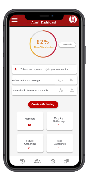
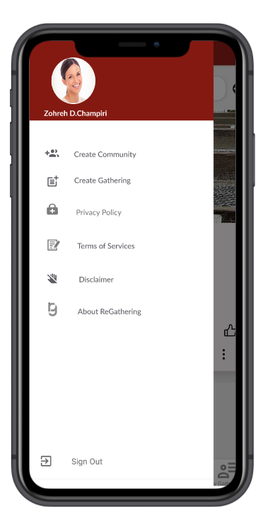
ReGathering
IOS and Android versions are available through Appstore and Googleplay
Ideation & Problem
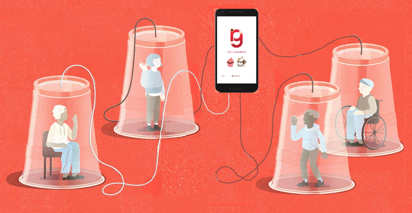
With visiting restrictions in place at long-term care facilities across Canada due to COVID-19, families in every community are facing challenges. As part of a new initiative, ReGathering is a platform to help people stay connected with their families, loved ones, and communities. It also helps communities to empower and unite people with different backgrounds. It expand the local networks and creates an atmosphere where ongoing fun and engagement can be made.
This app also helps newcomers in Canada to find their communities and reduces the immigrants’ challenges.
User Research & Solution

The goal of our research is to understand how ReGathering (RG) App might be useful for an allied platform to help immigrant newcomers and business communities and to empower and unite people with different backgrounds. Also, We aimed to examine if it is useful for users to expand the local networks and creates an atmosphere where ongoing fun and engagement can be made.
Therefore, our research goals are listed in the following;
- Identifying problems in the current design of the RA app or services that it provides
- Uncovering opportunities to improve
- Learning about the target user’s behavior and preferences
- Providing some design guidelines and enhancements
We conduct interviews with immigrants and ask;
1) About how you have incorporated the App into your daily life, as well as challenges/ shortcomings you experience in its use.
2) To talk about your needs and expectations as a business community or newcomer in Canada.
3) If you have a business here how RA app can help you with your business
Since this research is done using a semi-structured interview, we do not strictly follow a formalized list of questions. Instead, we will ask more open-ended questions, allowing for a discussion with the you as an interviewee rather than a straightforward question and answer format.
Design & Wireframing
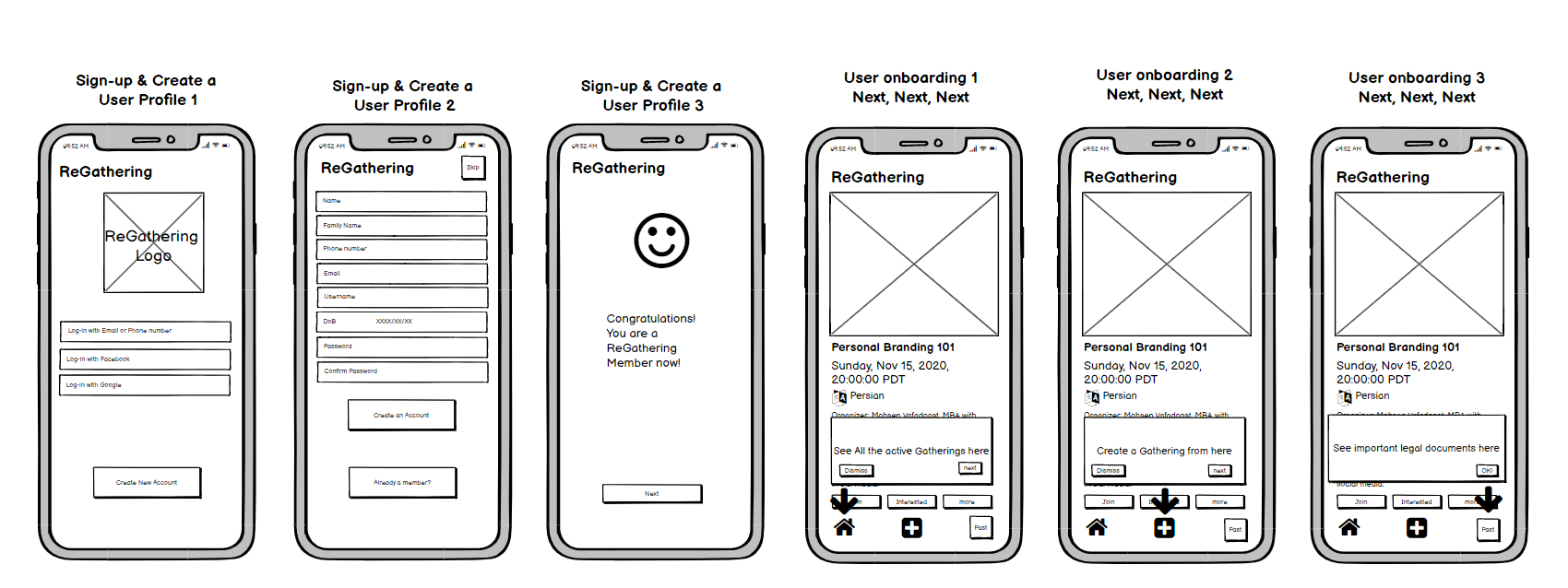
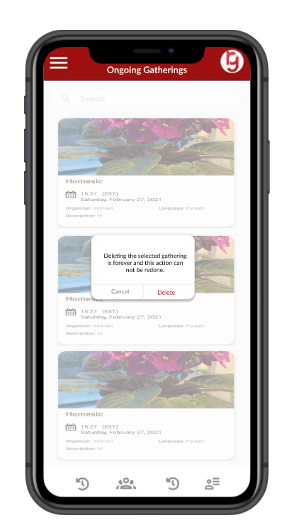
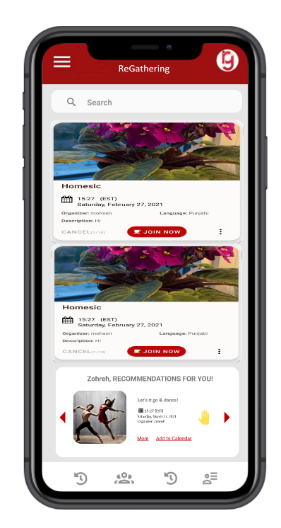
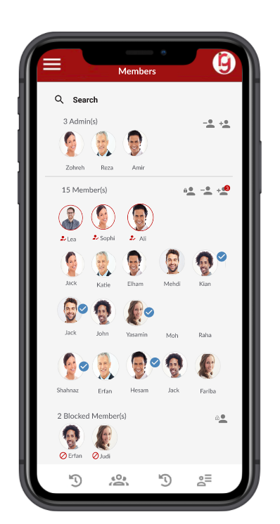
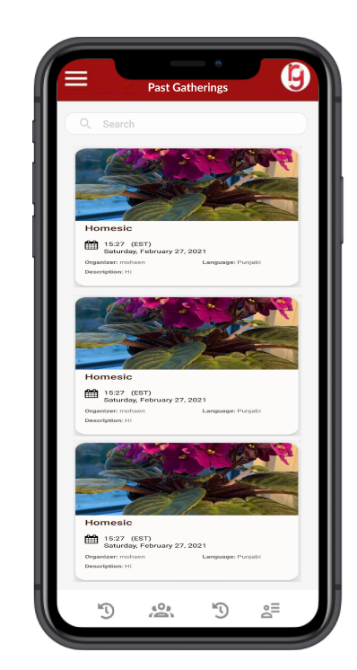
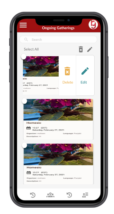
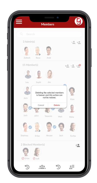
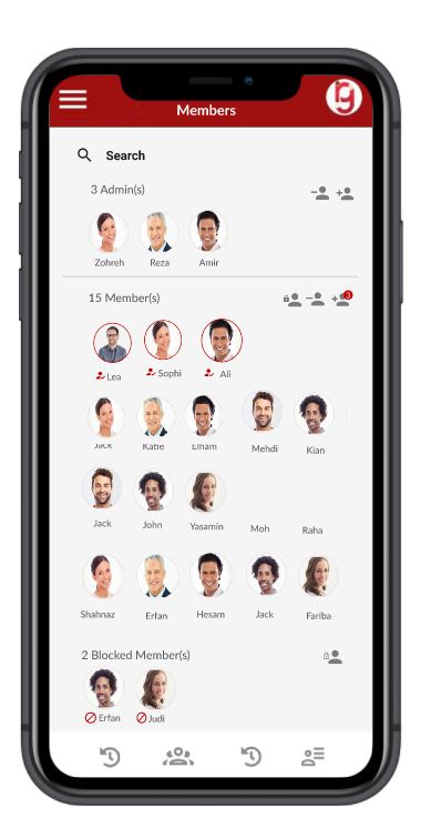
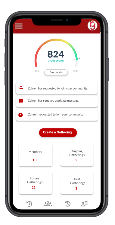
For this project, we had two types Low-fidelity (lo-fi) and High-fidelity (hi-fi). For lo-fi, we omitted any detail that could potentially be a distraction and include only simplistic images, block shapes, and mock content—such as filler text for labels and headings. For hi-fi, we made the pages interactive and considered all the details.
Evaluation & Testing
We came up with a two-phase user testing plan to retest the designs. This allowed us to gauge the expectations users have, the readability of data, and learn more about our users’ needs when interacting with our app. During this step, I was responsible for creating the prototypes and mocks we would be using during user testing. Also, we conducted ABS testing, Cognitive walk through and usability test (through a semi structural interview sessions) to examine the effectiveness of the mobile app.

